Photo by HalGatewood.com on Unsplash
“Usability is about people and how they understand and use things, not about technology” ~ Steve Krug
At my last meeting with one of my teammates, we started building a prototype for a project. Our aim with the prototype was to study the flow of a specific purpose about the project, collect and analyze some analytics and outline our next moves. As a developer, I wanted to profile the prototype, but obviously, mine wasn’t the only opinion on the table. So I asked if someone needed analytics, and the answer was “heatmaps?”.
What are and what to use
Heatmaps are a way to visualize data about how someone uses a service or a feature. For a web page, heatmaps can show how users move the mouse or touch the page. They usually use colours gradients to represent data.
So why do I need heatmaps? Heatmaps can help UX analyst to have a better understanding of where users focus their attention.
A great library for that is heatmap.js: open-source, available on Github and under MIT License.

Heatmap.js website with live heatmap tracking
Build your first heatmap
Heatmap.js has great documentation with lots of examples.
To start building your first heatmap, take a webpage and collect the events to plot. To collect data, I’m currently using RRWeb because of the package I’m writing (you can know more by reading this or checking Github), or you can use any package you prefer, like Cimice (I wrote an article on how to use it or again, check it on Github).
Once you collected all data, format them in a way usable by heatmap.js:
{
    x: 10,
    y: 10,
    value: 15
}
Heatmap.js will build the heatmap basing on the number of hits for a coordinate and the proximity between points. The goodness of the heatmap is strictly related to the data, so with few data, your map won’t really reflect your user's behaviour.
Let’s see how it works. The library is available via CDN or manually downloading the file.
<script type="text/javascript" src="https://cdn.jsdelivr.net/npm/[email protected]/build/heatmap.min.js"></script>The initialization is really simple: you choose the heatmap container, poll the data and format, then tell heatmap.js to build the map! For the very first example, I’ll use the entire DOM as map container:
<body style="min-height:100vh">
    <script type="text/javascript" src="https://cdn.jsdelivr.net/npm/[email protected]/build/heatmap.min.js"></script>
    <script type="text/javascript">
      const config = {
        container: document.documentElement,
      };
      const heatmap = h337.create(config);
      // Set data here
    </script>
</body>
Now gather data, you can poll them from a database (or any data source). I use RRWeb that collects lots of data, so they must be unserialized and structured as pointed before. I have just a few data, so I put the processing on the frontend:
const rawData = /* data from RRWeb as array */;
const data =
 rawData
  .filter(v => v.type === 3 && v.data.hasOwnProperty('positions'))
  .map(v => v.data.positions)
  .flat()
  .map(v => { return {x: v.x, y: v.y, value: 1}; })
  .reduce((acc, v) => {
      let position = acc.filter(el => el.x === v.x && el.y === v.y);
      if (position.length > 0) {
          position = position[0];
          let idx = acc.indexOf(position);
          ++position.value;
          acc.splice(idx, 1, position);
      } else {
          acc.push(v);
      }
      return acc;
  }, []);
I wrote this code really quickly for testing purpose, so this isn’t optimized at all. RRWeb stores lots of data, so:
- filter for type 3 filter was for mouse event holding a position,
- map takes the position,
- a record could hold more than one position, so just flat,
- map reformat the content to the desired format,
- reduce aggregate records with the same position data updating their value.
Once you have your data, you just:
heatmap.setData({
    min: 0,
    max: 100,
    data: data
});
My testing dataset is small, just 2370 records (a user session of some minutes) so min and max values are small for this case.
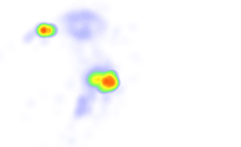
Generated heatmap
This seems totally meaningless. But, if you repeat this on the page where data were collected, it starts making sense.
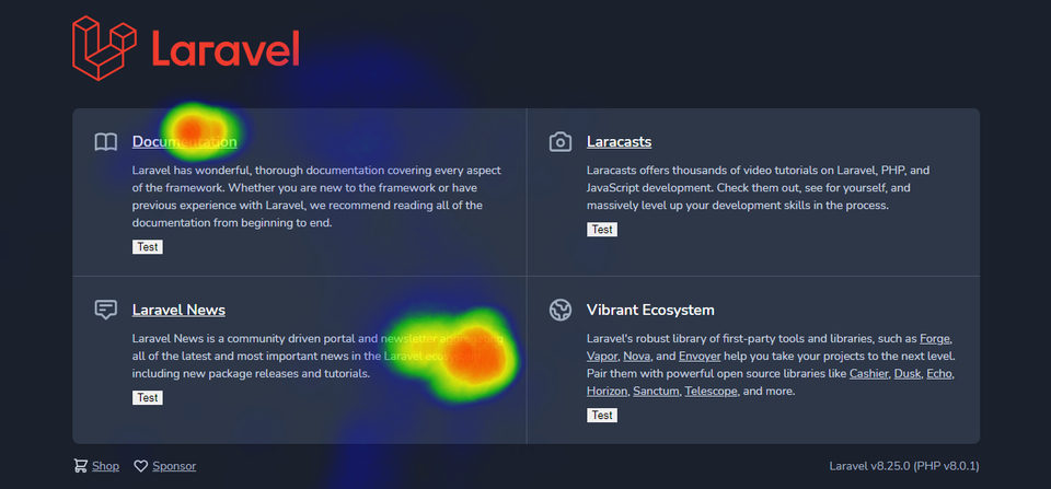
Generated heatmap
Remember that to really reproduce user behaviours, you should report data on the correct scale: if you want to build a heatmap at 1920x1080 and your data is at 1280x720, you should consider using a scaling factor of 1.5x or to build different heatmaps based on data.
Improve your data-driven decision with data
We’re just scratching the surface with this heatmaps, you can use them combined with session recordings, export them to image or PDF, combine them with other analytics to have a better understanding of the system. You can even track how any page change reflects the user behaviours, checking heatmap changes over time!
Now it’s up to you to build something great! 🥂
Stay tuned for other Data-Driven Strategies and if you want, take a moment ️️to leave a comment about how you take data-driven decisions supported by tools! ☕️